01
Removed upfront pricing
Price without context = barrier. Moved pricing to the conversation phase where we could provide context and address objections in real-time.
Fixing a 0.2% conversion rate by redesigning our managed services page with trust signals and premium positioning.
$350 higher ARPU through trust-first design and premium positioning.
I started by mapping the complete journey to understand where the real bottleneck was. Here's what I found in December 2025:
Dashboard Visits
10,321
CaaS Page Visits
2,477
Bookings
6
Calls Scheduled
13
Deals Closed
6
The data told a clear story. We had no traffic problem: 24% of dashboard visitors clicked through to the CaaS page, which is strong for a premium upsell. And our close rate on calls was solid at 45%. The entire funnel was collapsing at one point: the CaaS page itself. That's where I focused.
Not all 2,477 visitors were equal. When I segmented by store size, the picture sharpened. This managed service was designed specifically for stores with 10,000+ orders — enterprise merchants with complex needs and higher willingness to pay.
< 2k orders
297 visits
0%
Not target segment
2k-10k orders
189 visits
0%
Not target segment
🎯 10k+ orders
31 visits
3.2%
TARGET SEGMENT
The 10k+ segment was our target audience for managed services, and they were actually converting slightly better (3.2% vs 0% for other segments). But 31 qualified visitors producing just 1 booking was still far below target. The page wasn't completely broken for them; it just wasn't earning their trust fast enough.
Leadership had already validated the strategic value of managed setup. The numbers made the opportunity clear:
Current state: 1 booking/month from 31 qualified visitors = 3.2% booking rate
Target state: 15% booking rate = ~5 bookings/month from same traffic
Revenue math:
This wasn't just about conversions. Data showed managed setup customers had 40% lower churn than self-serve in the 10k+ segment. Every booking we missed was a customer we'd likely lose later.
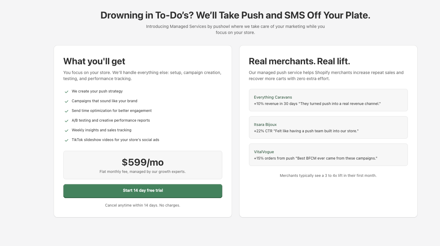
I started by looking at the existing page with fresh eyes, trying to understand what a first-time visitor would experience. The design was polished and Shopify-native. It had clear pricing, feature lists, proof points with numbers, and information about our strategists. On paper, it checked every box.
But here's the thing: it was showing too many decisions too early. Pricing, results, features, and team information, all hitting users at once before they'd developed any relationship with us. The page read like a sales pitch, not a conversation. And when you're asking someone to pay for a premium service, trust matters more than information.
I brought this to the team and my manager echoed what I was thinking: maybe asking users to start a trial wasn't the right first step. They suggested trying a lead form or Intercom conversation instead. Another colleague, Anandhi, shared her experience from a previous company where a similar high-value service had the same problem. Their solution? A free 30-minute consultation call. It bridged the trust gap and became their biggest conversion lever.
This reframed the entire problem. We weren't selling a product. We were selling expertise. And expertise requires trust before transaction.
I'm interested, but I need to understand exactly what you'll do for my 15k order/month store before I commit.
The pricing looks good, but I don't want to waste time on a trial if this isn't the right fit for us.
Can I just talk to someone about our specific situation? I don't want to start a trial and figure it out myself.
Hypothesis: If we reframe the page around earning trust before asking for commitment, booking rates will increase significantly for the 10k+ segment.
V1: Information-First (Baseline - existing page): Feature-first, decision-heavy before trust was established
I prototyped four different approaches to build trust before asking for commitment. Each iteration was informed by team feedback and patterns from successful premium service pages.
I prototyped a completely different approach. Instead of leading with what we offer, I led with where the user is emotionally. The structure followed a story arc: problem → talk → value → process → reassurance → pricing.
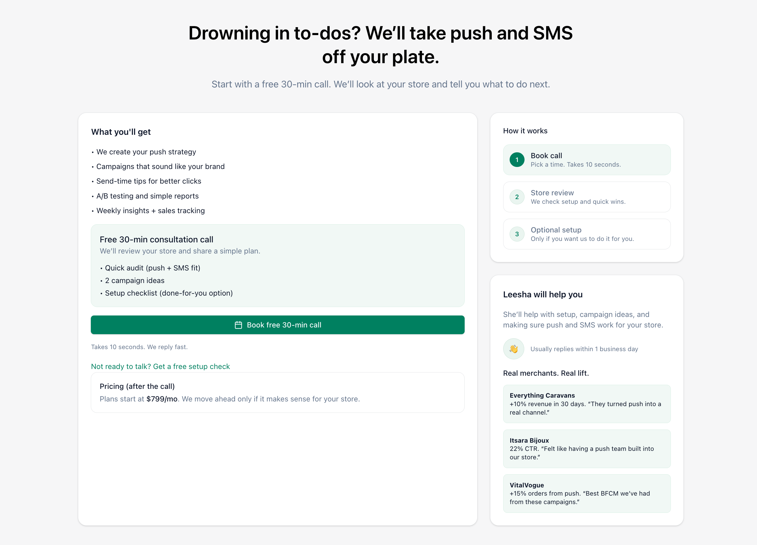
Leading with user problems and emotional state
Leesha (growth lead) pushed for visual examples over text descriptions. Users wanted to see what they'd actually get. I added real email templates with performance metrics to show the caliber of work we deliver.
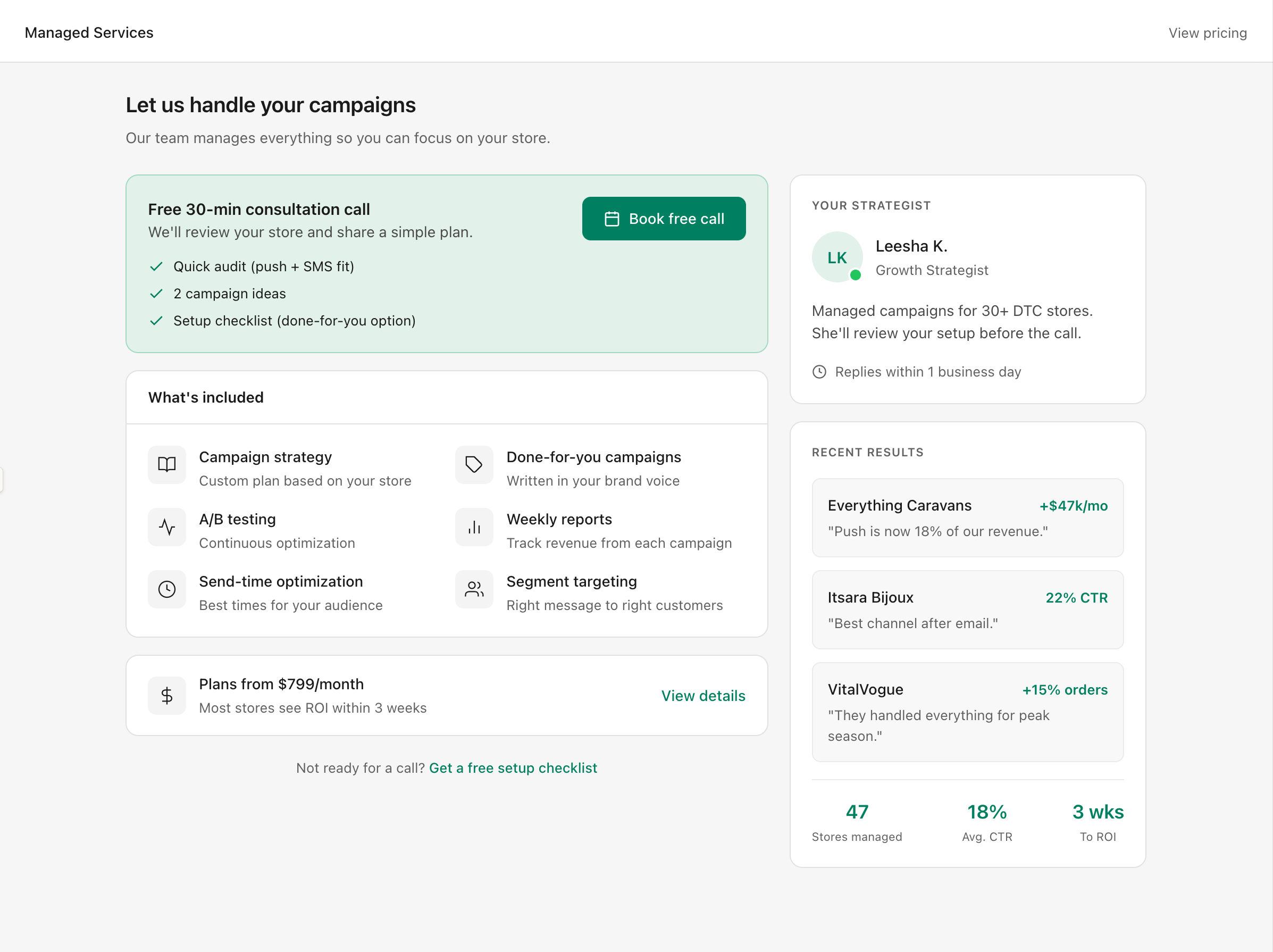
Added real email templates with performance metrics
My manager gave direct feedback: "Turn email and SMS into predictable revenue" described the outcome but not the offer. We iterated to "We Run Your Push, Email & SMS. You Watch Sales Grow." The value proposition became unmistakable.
Unmistakable done-for-you value proposition
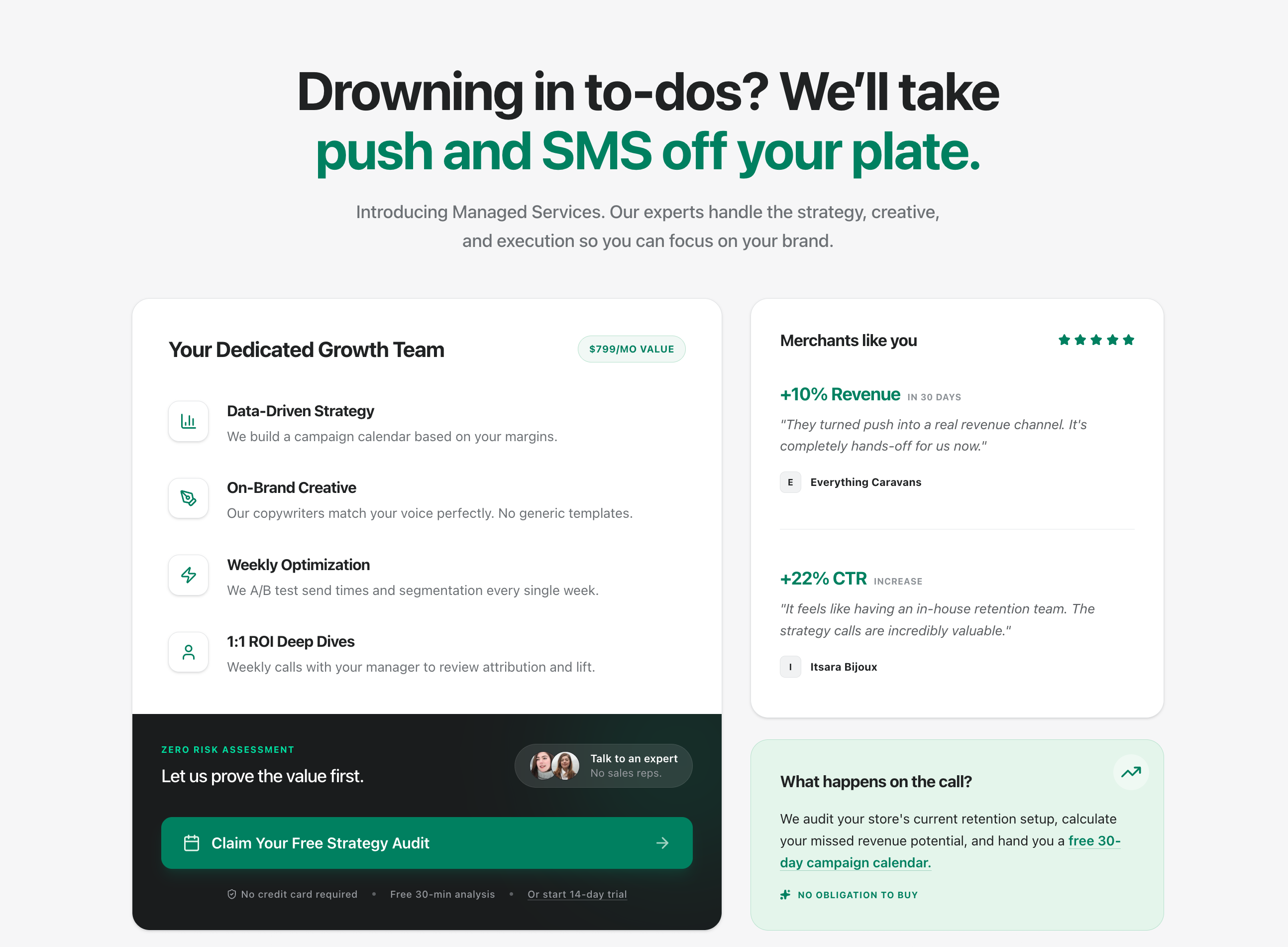
Final version in action, showing the complete trust-first experience
Price without context = barrier. Moved pricing to the conversation phase where we could provide context and address objections in real-time.
Changed from "Start Trial" to "Claim your free audit". Lower commitment threshold that positioned the call as value, not sales.
Limited spots = premium positioning. "3 spots left this week" created urgency and signaled high demand without feeling pushy.
In-product pages need instant clarity. A single screen with clear value, visual proof, and one action demonstrated confidence in the offer.
Scope Definition
In scope: CaaS page redesign, copy iterations, visual template showcase, CTA restructuring
Out of scope (Phase 2): Pricing page changes, checkout flow optimization, Calendly integration
Not doing: Long-scroll landing page format (contradicts in-product design principles)
A single word can shift the entire emotional framing of a CTA. During our copy iterations, we debated this exact question.
Our Recommendation: Use "Schedule"
We chose "Schedule Your Free 30-Minute Strategy Call" over "Book a Call" for three reasons:
💡 Proposed A/B Test
The best answer is always data-driven. We can easily test this:
BEFORE
3.2%
booking rate (1/31 qualified visitors)
AFTER
12%
booking rate (4/33 qualified visitors)
IMPROVEMENT
275%
increase in booking rate
Additional metrics:
Key insight: We didn't hit the 15% target, but 12% represented a 275% improvement over baseline. The capacity signal addition alone drove a 67% lift in the final iteration. More importantly, the downstream metrics validated the approach: managed customers showed 40% lower churn and $350 higher ARPU, proving the business case for investing in trust-first design.
"Trust before transaction. For premium services, the 'buy' button is the wrong first step."
What I'd do differently: Spend more time upfront talking directly to 10k+ merchants. We had strong analytics showing what wasn't working, but I inferred why based on patterns and team intuition. Direct user conversations might have shortened the iteration cycle and surfaced insights we missed earlier.
Still, the numbers tell the story. Sometimes the biggest design opportunities aren't about creating something new. They're about removing the barriers that prevent great value from connecting with the people who need it.