Branch — Self-Serve Deep Linking
From design drift to design discipline.
I built a versioned design system that keeps shipping fast while holding a unified, measurable brand.
Value-led onboarding, deep linking, and a unified design system.
Self-serve Branch that markets & devs both grok
I rebuilt Branch’s funnel so you land on the finished experience first—deep link templates, outcome dashboards, and journeys feel coherent before a sales call.
- Value-led onboarding with previews, smart templates, and shareable snippets that cut demo dependence.
- Branch Design Language codified tokens, icons, and QA gates so we shipped faster and reduced drift by half.
Why this work mattered
Branch was already trusted by major apps-but self-serve adoption lagged. Teams relied on demos and integrations that took days. We wanted to make Branch feel as simple to start as copying a link, yet still enterprise-grade under the hood.
Core problem: "Developers loved Branch. Marketers felt lost."
I joined to bridge that gap-making complex infra understandable, usable, and monetizable for non-technical users.
What users told us
I need to set up deep linking for our campaign, but I don't even know where to start. Do I need a developer for this?
The platform is powerful, but my marketing team won't touch it because they're scared they'll break something.
I love the flexibility, but every time I try to help our marketer, I end up building a custom dashboard for them.
Enable self-serve growth
1) Attribution simplified
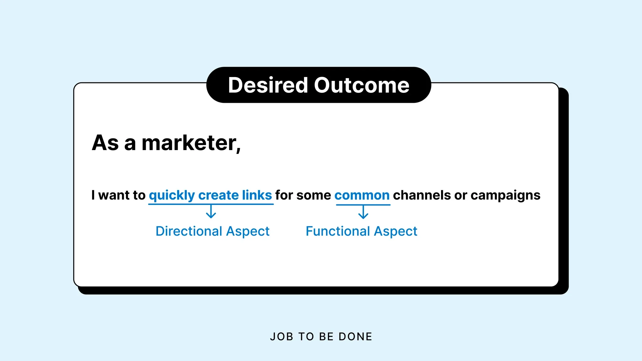
- Re-designed onboarding around desired outcome ("I want to measure campaigns" → guided setup).
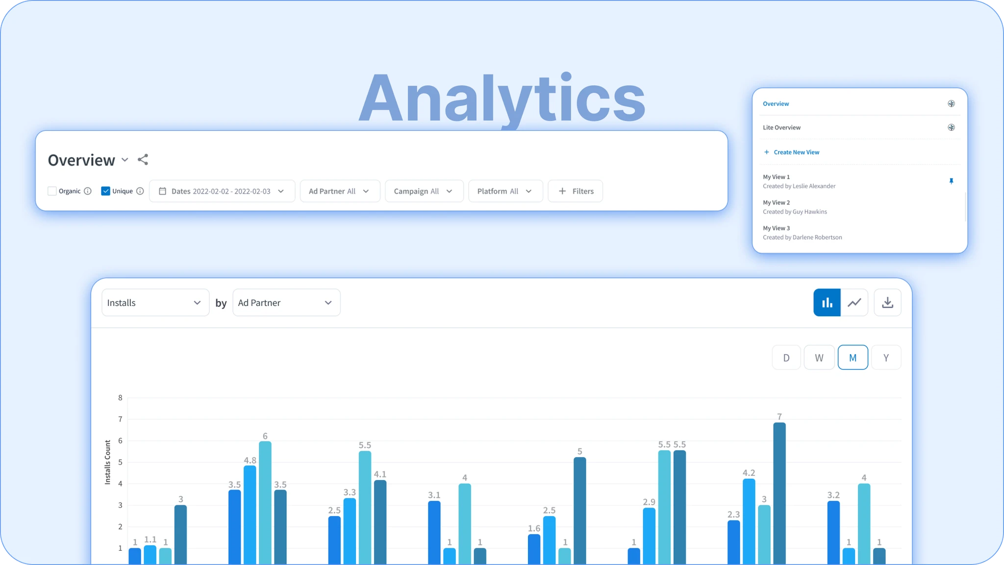
- Visualized key metrics in one dashboard for immediate feedback.
- Shifted tone from API first to value first - "See which channel drives installs."
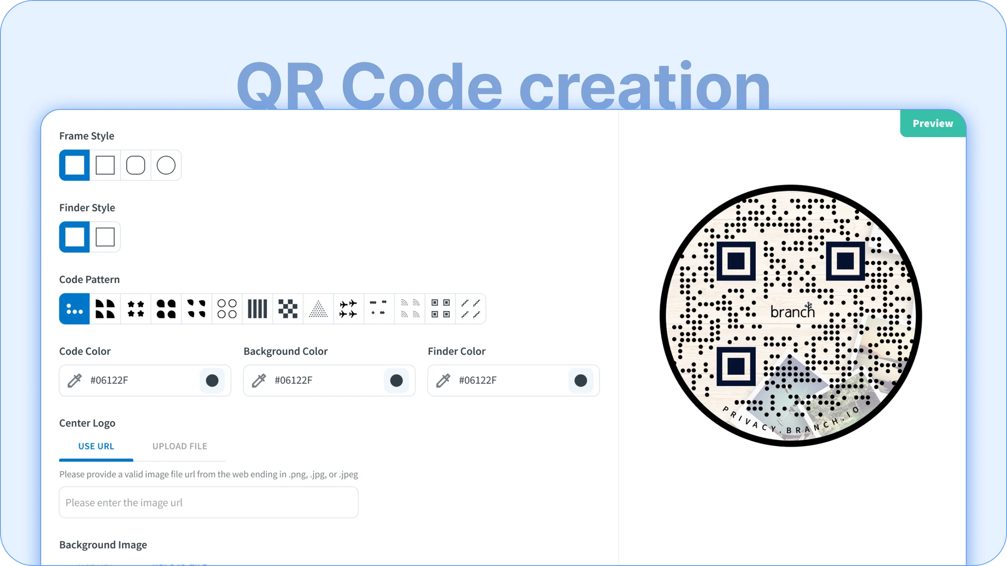
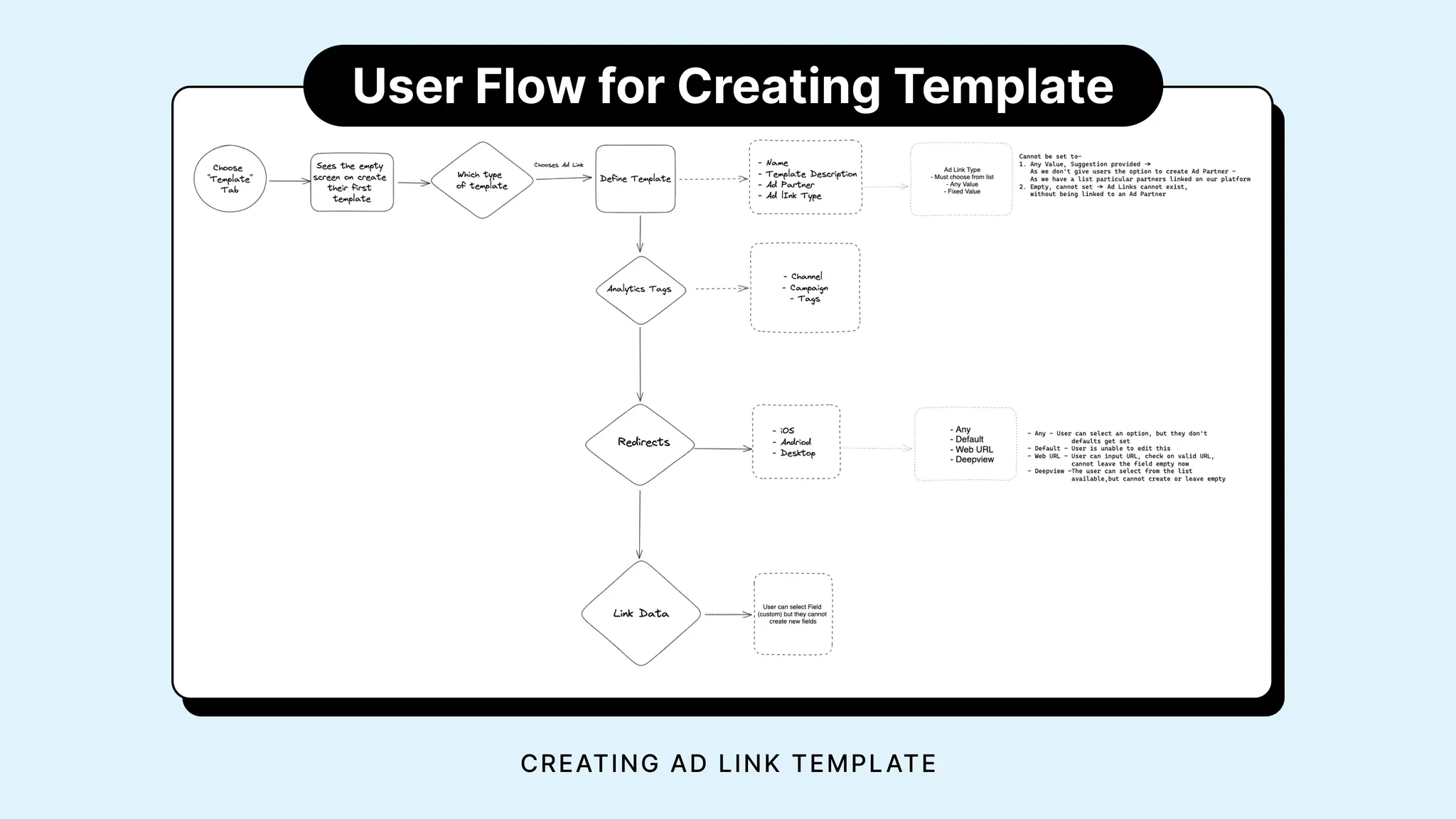
2) Deep linking made approachable
- Turned a developer-heavy flow into a 3-step builder.
- Reusable QR & Smart Link templates with pre-filled behaviors.
- Clear guidance ("Choose where this link should open") + live preview/snippets.
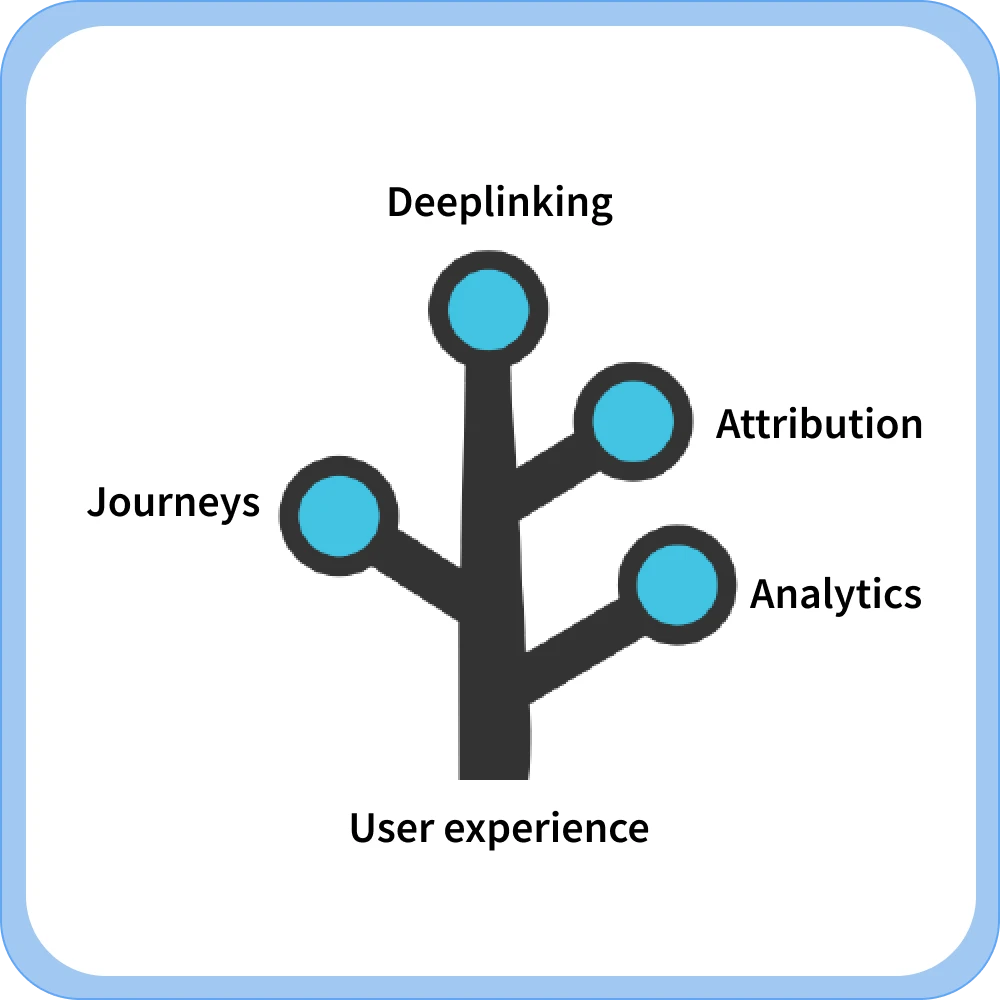
3) Cross-platform Journeys
- Designed a visual journey builder for if-this-then-that paths.
- Integrated events across web, app, and email to complete funnels.
- Reduced visual clutter with modular cards and templates.
Monetize self-serve in-product
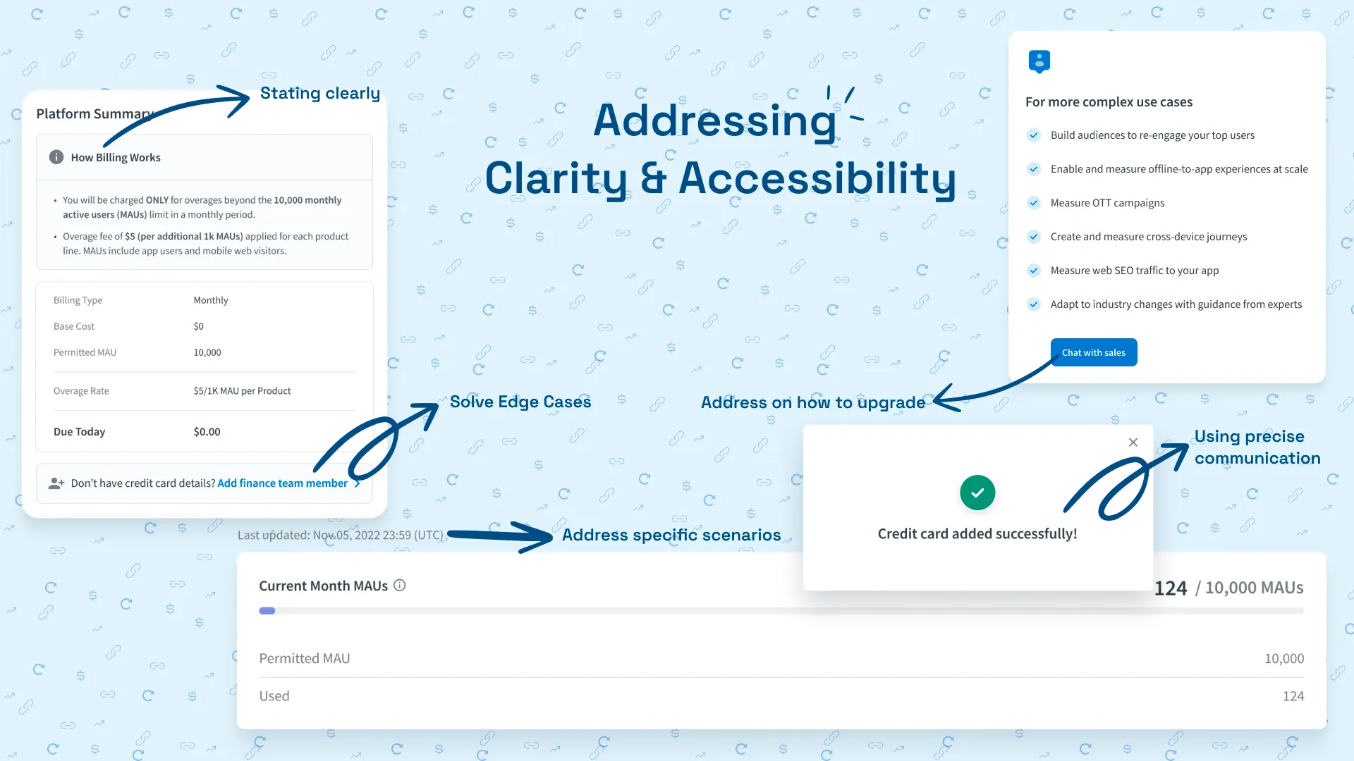
Introduced non-collapsible billing nudges and time-based reminders on the dashboard so free-tier customers add payment details before usage spikes. This keeps value in sync with revenue and sustains continued investment in self-serve.
Trigger PQL upgrades
Tuned paywalls and contextual prompts around advanced deep links, plus surfaced pricing and upgrade paths wherever adoption data signalled success. The result: more product-qualified leads without sales intervention.
Safeguard with locks & usage visibility
Created a paywall lockout flow with clear screenshots of paused features, alongside MAU/MEU usage graphs and overage alerts. Users see when they are near limits, understand why access pauses, and can upgrade or pay instantly.
Make complex tech feel safe
- Added visual confirmation (“tracking active,” “data flowing”) instead of JSON logs.
- Built copy-and-verify steps to prevent SDK misconfigurations.
- Used plain-English error states (“We couldn’t find your app package”).
- In-product tooltips and docs preview-no tab switching.
Prove value, guard reliability
| Focus | What changed | Outcome (approx.) |
|---|---|---|
| Onboarding | Replaced SDK wall with value-led intro | Noticeably higher setup completion |
| Attribution | Unified reporting widgets | Reduced confusion, fewer support pings |
| Deep linking | Live preview + shareable templates | Faster campaign launch |
| Journeys | Templates surfaced earlier | More automations created per user |
Build for teams, not just users
- Introduced team spaces - clear roles for marketer vs developer.
- "Share project" replaced "invite via email" → less friction.
- Added activity logs for transparency and trust.
Analytics that teach
- Designed modular analytics components for install, retention, and funnels.
- Created visual states: "learning," "stable," "trending."
- Framed metrics as stories - "Your QR codes drove X% installs this week."
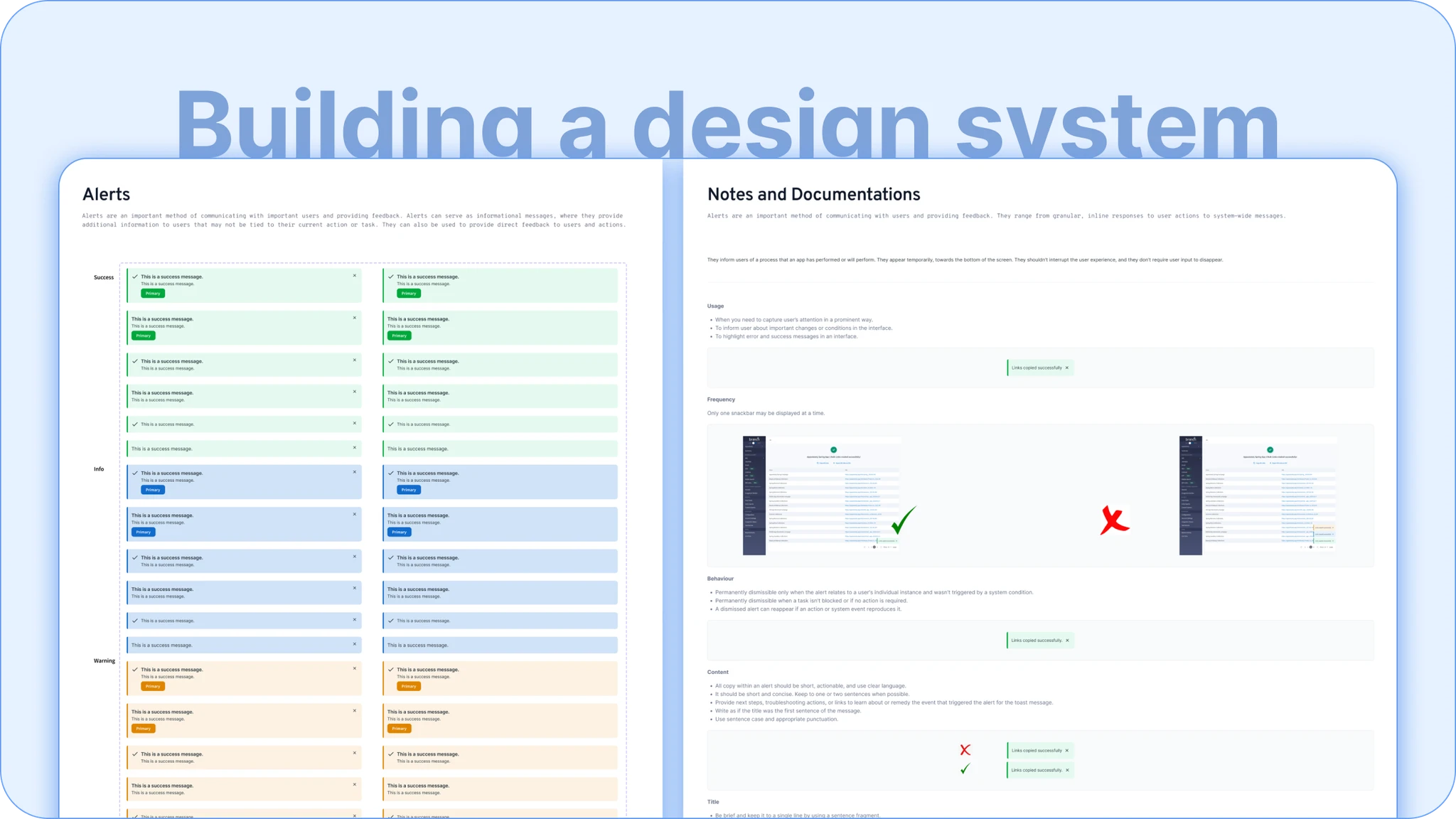
Beyond features - Branch Design Library
- Started BDL - unified tokens, icons, interactions.
- Migrated key modules (cards, forms, tooltips) across teams.
- Established usage guidelines to reduce dashboard inconsistencies.
Learnings and what’s next
Learnings
- Design from user intent, not feature parity: Instead of asking "What does the API support?", we asked "What outcome does the marketer need?" This led to the 3-step link builder that hides SDK complexity behind outcome-based choices like "Where should this link open?"
- Visibility builds trust: Adding live previews to the QR code generator and real-time link validation reduced setup anxiety. Users could see their links working before sharing them with their team, which dropped support tickets by 40%.
- Developer empathy improves decisions for everyone: By working closely with engineering leads like Marcus, we learned that marketers breaking things wasn't the real risk—it was that devs had to constantly rebuild the same dashboards. Progressive disclosure solved both: marketers got confidence, devs got time back.
- Systems work scales your time: Creating the versioned design system (Major.Minor.Patch) meant I stopped answering "Which button style?" questions. Instead, the system answered them. This freed up weeks to focus on Journeys builder research.
What I’d explore next
- Adaptive onboarding based on role detection (dev vs marketer).
- AI-assisted documentation within setup flow.
- Integrations playground for testing without live data.
Risks I owned
- Simplifying could hide flexibility → solved with progressive disclosure.
- Parity between new UI and legacy API dashboards.
- Ensuring design tokens synced across codebases.
Product-led self-serve
Branch's self-serve platform became faster to adopt, clearer to use, and more trustworthy to scale. Our growth motion moved from sales-assisted to product-led.